ShopDreamUp AI ArtDreamUp

Deviation Actions


Suggested Deviants


Suggested Collections


You Might Like…


Featured in Groups

Description
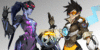
This took awhile, but I'm only getting better I feel :3. I really enjoyed working on this piece, it all came from suggestion really, so thank you to the people who voted for her! Those who are not aware of what character this is, it's D.va from Overwatch.~
My Patreon: www.patreon.com/Doskii
My Patreon: www.patreon.com/Doskii
Image size
1280x1920px 2.53 MB
© 2017 - 2024 DoskiiLee
Comments2
Join the community to add your comment. Already a deviant? Log In
Overall, I'd say this piece is very good.
There is a clear use of color theory as the highlights and shadows are not just shades or tints of the original hue but instead shadows and tints of another hue. This helps to pop the piece and make it more colorful and life life, and it is done very well in this piece.
The shading of this piece is very well executed, and the artist shows a definite understanding of how their art program works, as well as how to successfully create a line less drawing that appears more realistic, but still keeping the cartoon look of the face.
There is a small problem with the hair, however, as the hair's volume is not distinct enough. It seems to blend together with the highlights and the dark, and it looks like a blurry mess. Even each individual strand of hair drawn does not help this problem.
The dominant problem area's of the piece mostly rely in perspective and anatomy. The torso is too long compared to the relativity of her arms and how low her hips start, and this causes her to look stretched out and unnatural.
D.va's face is at a very awkward angle, and the angle causes the chin to look too pointed, and looks inconsistent with the lips. The corner of the lips closer to the edge of the face should be smaller in size as the lips are turning across the edge of the face.
This can be fixed by thinking of the face as a sphere. If you placed a sphere at this angle and molded a 3D rectangle onto the face, part of the rectangle would be distorted as it reaches it's perspective point.
The arms are very thin on her, as well as too curved for D.va's stature. The meat on the arms is inconsistent on both arms, as one arm seems to have a thinner wrist than the other.
D.va's mech is smaller in proportion to her in this piece, as D.va would barely be sitting on the window of her mech. If her mech was this small in the actual game, she would not be able to pilot it as she couldn't even fit in it.
The hand holding the mountain dew is proportionally correct, but it doesn't look like she is grasping the bottle, and instead it looks as if she is about to drop the drink.
The pose, overall, looks stiff and almost uncomfortable. The body leans in a way that isn't natural, and I believe this error to be because of the lack of understanding of perspective. Her body seems to be leaning back, but yet her upper body is larger than her waist. If she was actually sitting on her mech from the angle the artist is trying to convey, which is a lower angle, then her head would be smaller and moved behind other body parts like her shoulders or chest.
Most of these problems can be fixed by using art model references, either pose models or 3d models. It is unclear if a reference for this piece was used or not, but having your model and drawing side by side while drawing can help with the proportions. Personally, I recommend a 3d program like Design Doll (a program specifically designed for anatomy dolls and is very customization) to get poses.
The green emojis take away from the piece as a whole as they are distracting to the viewer, and they don't necessarily point to where you want the audience to be looking first.
Overall, the only flaws in this piece have to do with anatomy and perspective, but the piece has many great qualities to it that many artists can study from and learn from. The coloring is still pleasant to look at, and so is the painting technique used.